
Identity / Photography / Print / Digital
/ Campaign / Environment
Identity / Photography / Print / Digital
/ Campaign / Environment
Client: Workplace House - Kinnarps
Everything in its place:
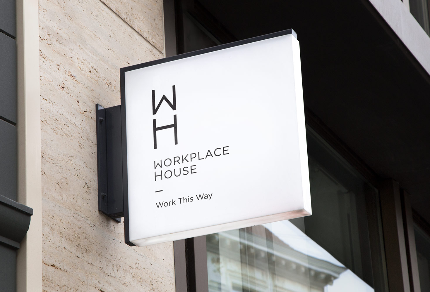
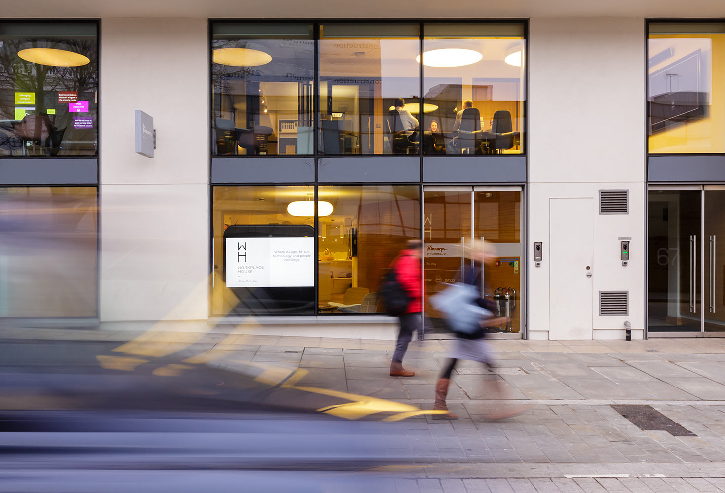
In its infancy, Workplace House - a shared office space for furniture, technology and workplace specialists - needed a visual identity which turned heads in Clerkenwell.
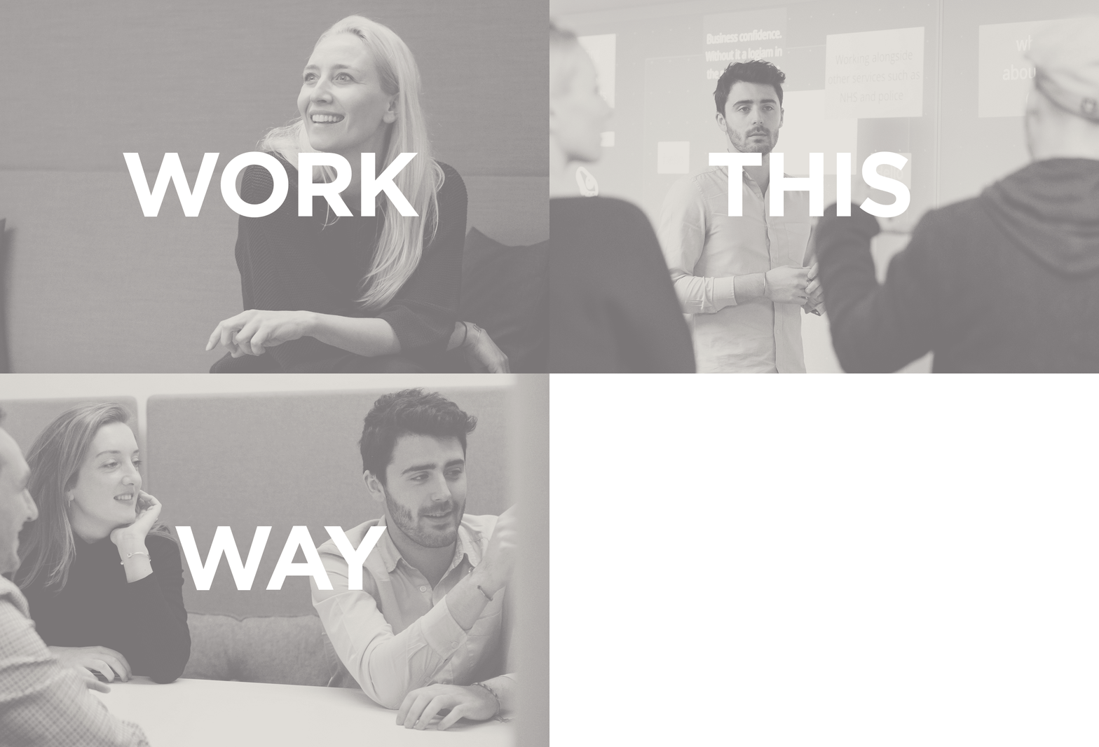
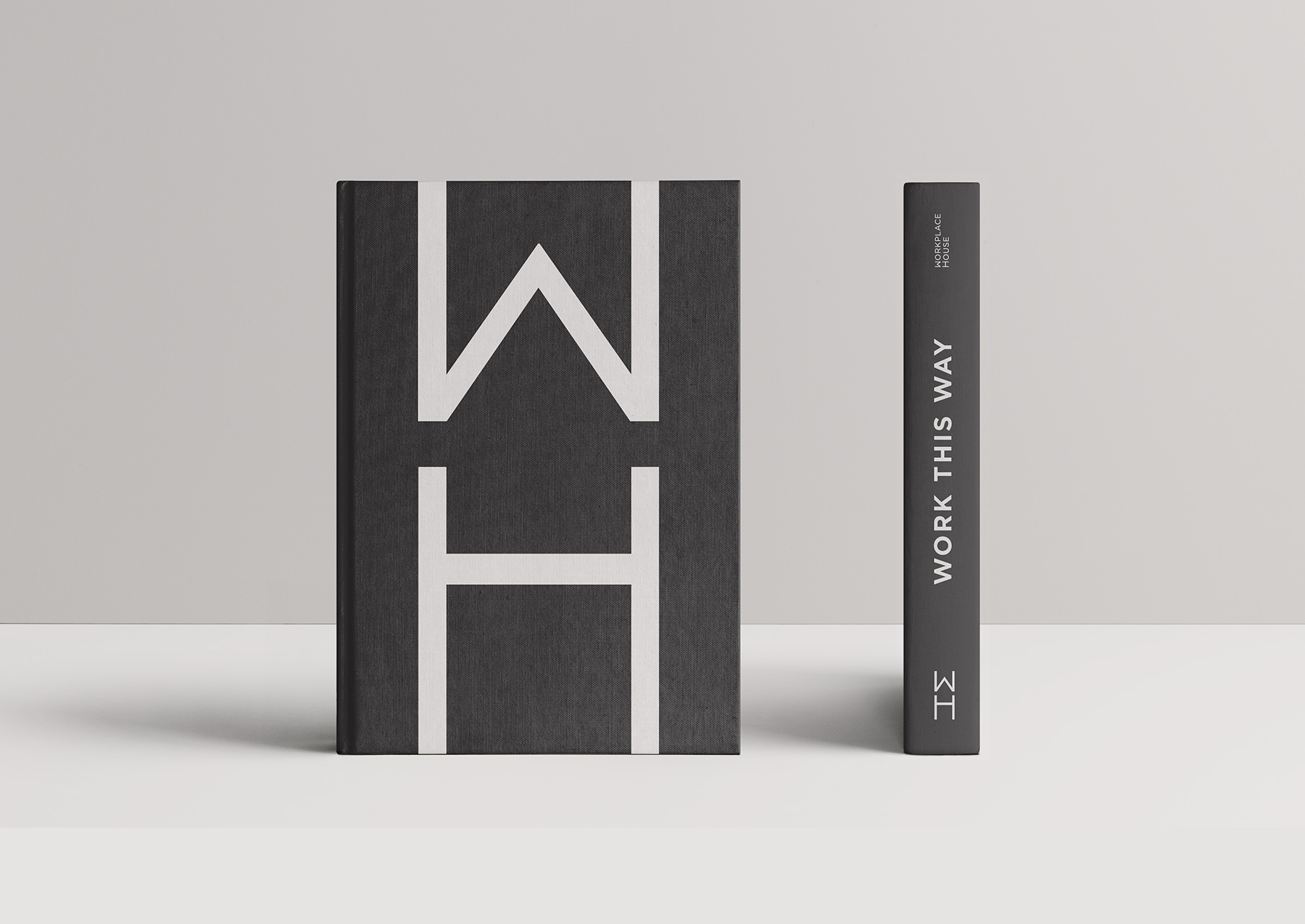
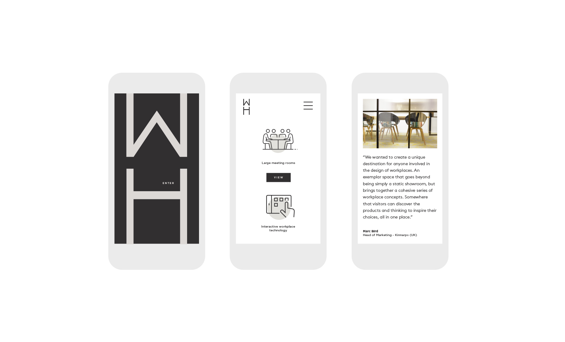
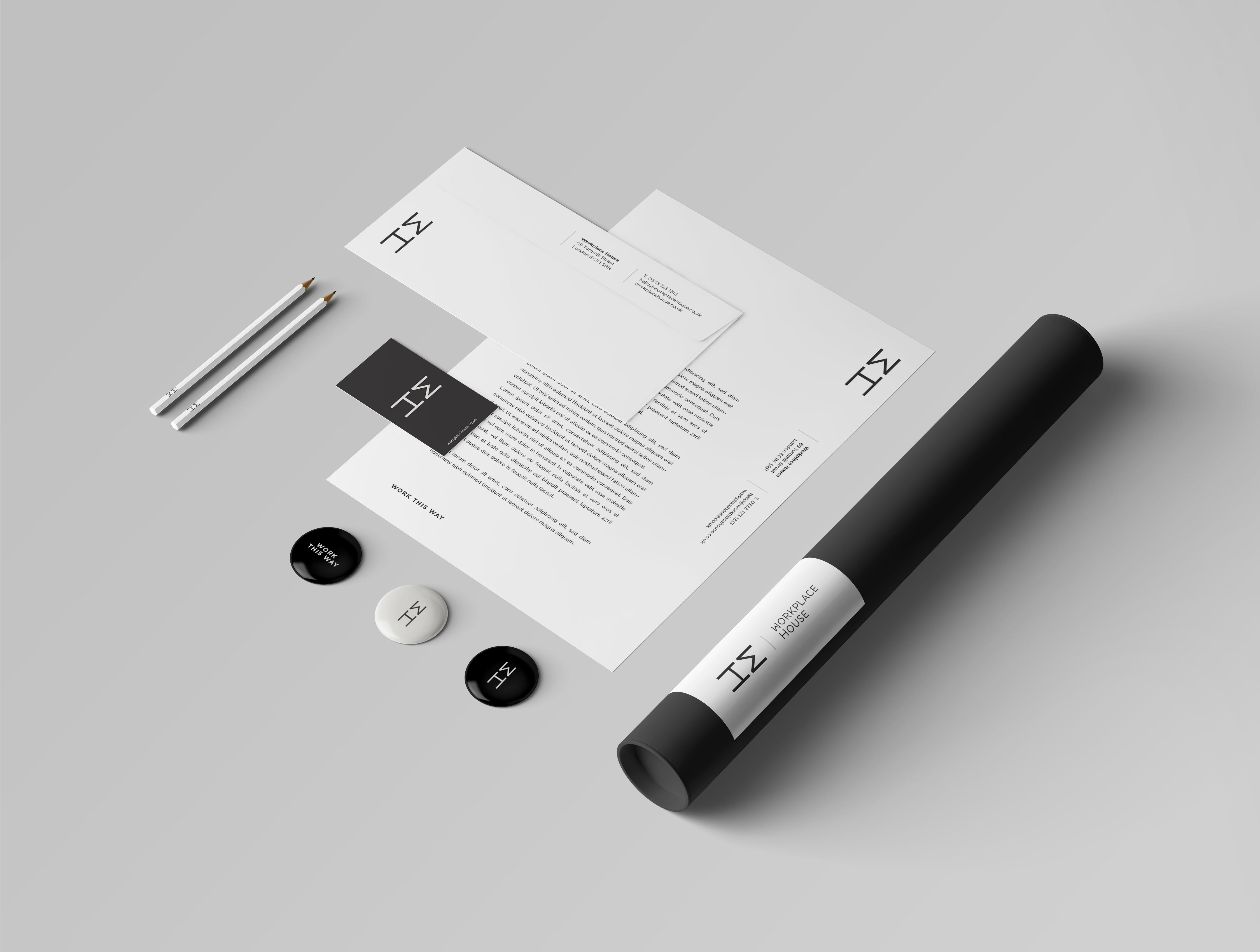
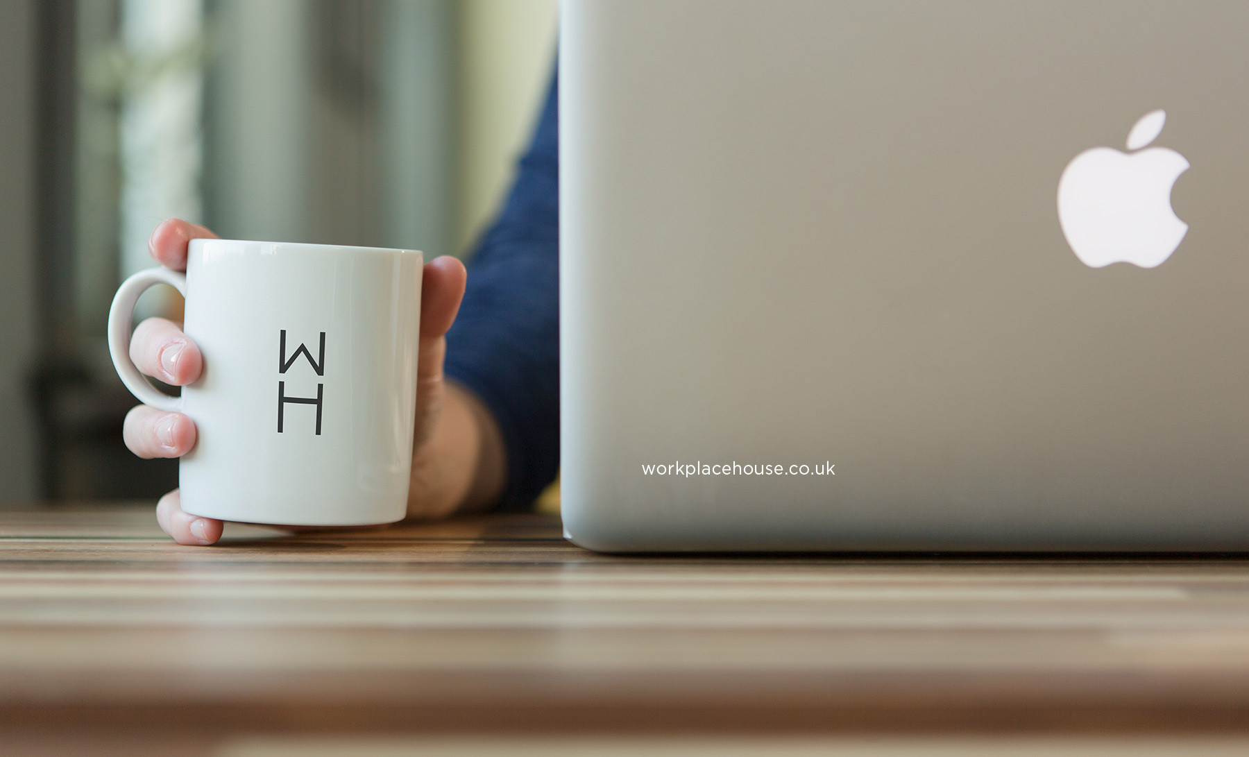
We created an identity which is daringly minimalist - bold enough to stand out on the crowded streets. duotoned photography gave distinction and sophistication, whilst maintaining contrast with the multiplicity of sub-brands inhabiting the space.
Everything in its place:
In its infancy, Workplace House - a shared office space for furniture, technology and workplace specialists - needed a visual identity which turned heads in Clerkenwell. We created an identity which is daringly minimalist - bold enough to stand out on the crowded streets. duotoned photography gave distinction and sophistication, whilst maintaining contrast with the multiplicity of sub-brands inhabiting the space.
.
Everything in its place:
In its infancy, Workplace House - a shared office space for furniture, technology and workplace specialists - needed a visual identity which turned heads in Clerkenwell. We created an identity which is daringly minimalist - bold enough to stand out on the crowded streets. duotoned photography gave distinction and sophistication, whilst maintaining contrast with the multiplicity of sub-brands inhabiting the space.
.



Similar Projects
Kinnarps - Nu CampaignSomthing Nu

By Alastair LittleA Little something special

Appin DevelopmentPride of Scotland
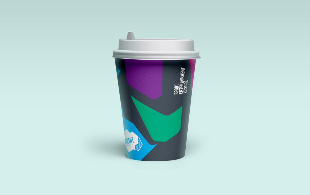
Vibrant PartnershipsNot a venue. A destination.

AshbyCapitalBuilding Creativity

Workplace HouseEverything in its place

BPS Worldwide RecruitmentAttracting attention
Little London EstateWelcome to work

MCC - Spirit of CricketCore of the game

Third Sector PropertyA clear direction

RDISeeing Red
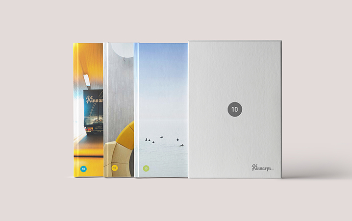
Kinnarps - 10 SeriesTen of the best

The Connolly WorksA new Chapter

Parent MarketingBorn with a vision

Atum Cove - EgyptCharting The Red Sea

Rock UK Adventure CentresIgniting a passion

Novae GroupSculpted excellence
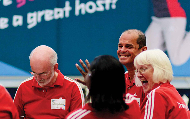
London 2012Playing our part
All copyright Sadler Greenwood 2025
